Examples
How the Navix identity works in practice – and how the visual building blocks together create a consistent, recognisable expression.
How to read this chapter
Every example is built from the same few parts. The markers show which building block is at work – and where.
Select a note to highlight it in the image, or open any image at full size. Each tag links to the guidelines for that element.
05.1 Events
Exhibition material
At a trade fair, the stand is often the first encounter with Navix. Large formats need few elements: the logotype placed high, the main message, generous imagery and colour fields that read from a distance.
01.Exhibition stand
02.Roll-up banners
05.2 Events & offices
Digital screens
On large screens, motion and scale do the work. Keep the layout to a moving image, the logotype and one message – and let the image breathe.
- Logotype Negative logotype on Deep Sea Blue, top right.
- Typography Two levels of type: a bold line and an italic serif accent.
- Cut corner The video frame carries the cut corner.
- Imagery People in conversation – the close side of the image concept.
05.3 Print
Business cards
The business card is small but complete: logotype, colour, the Loadline and both typefaces on 85 × 54 mm. Always use the template – only names and contact details change.
01.Front and back
02.Edge detail
Ordering new cards? Start from the InDesign template.
Business card template05.4 Signage & details
Material-adapted logotype
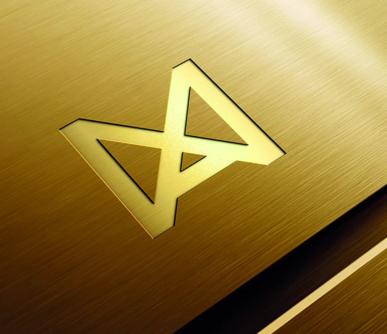
In glass, metal and textile, the logotype adapts to the material – frosted, recessed, engraved or embroidered. Colour may give way to texture, but the shape is never altered.
One shape, every material.
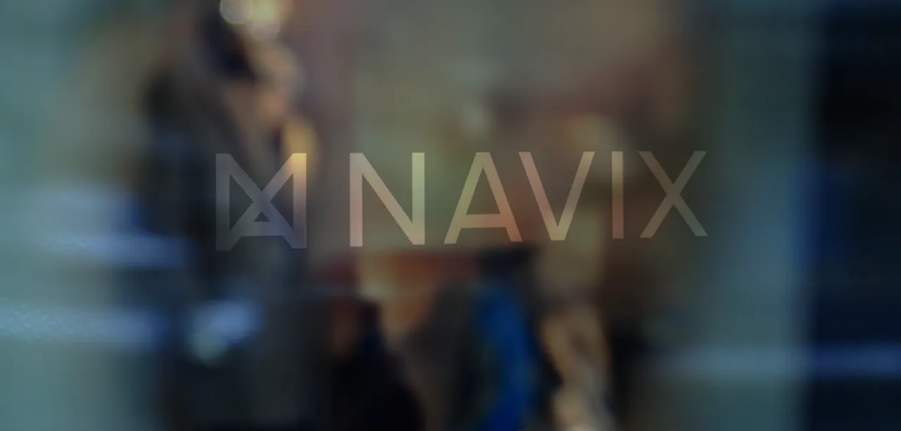
01.Glass
Logotype The full logotype in frosted film – at architectural scale, no colour is needed.
02.Metal
- Logotype The logomark only, recessed into brushed gold – the shape is reproduced exactly.
03.Details
- Logotype The logomark engraved – the symbol works where the wordmark would be too small.
05.5 Profile products
Merchandise
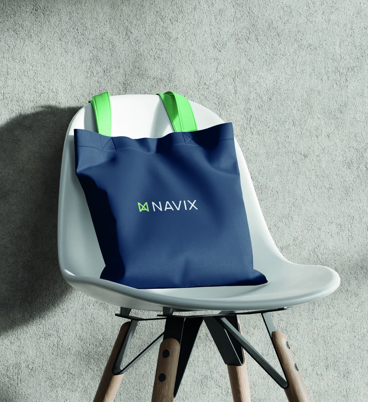
On products, the logotype is applied with restraint: one clear placement, quality materials and colours from the palette. Deep Sea Blue is the natural base.
05.6 Web & social
Digital
Online is often where people meet the identity first. The website and LinkedIn share the same elements: moving imagery, the main message, Digital Green for calls to action and a calm, generous layout.