

Part 2 Chapter 04

Visual identity

A clear and consistent visual expression that reflects Navix’s position and personality.

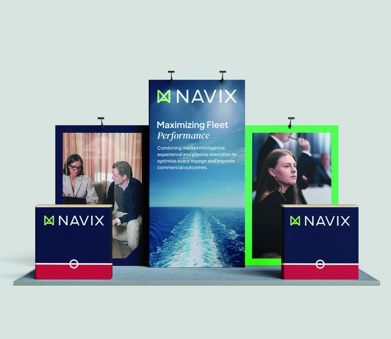
A Navix exhibition stand with roll-up banners and counters in Deep Sea Blue, Digital Green and Brand Red.

Chapter 04 – Overview

One logotype, two typefaces, eight colours, a cut corner and a clear image language – together, one consistent expression.

The Navix visual expression is pared back and built on a few recurring elements. Used consistently and with restraint, they make Navix recognisable without dominating the message.

This chapter describes each building block and how to apply it. Every part has its own section below, with rules, live examples and files to download.

Visual identity

Typography

Two typefaces and a few clear levels. Plus Jakarta Sans carries everything – DM Serif Text Italic adds contrast and character where it matters.

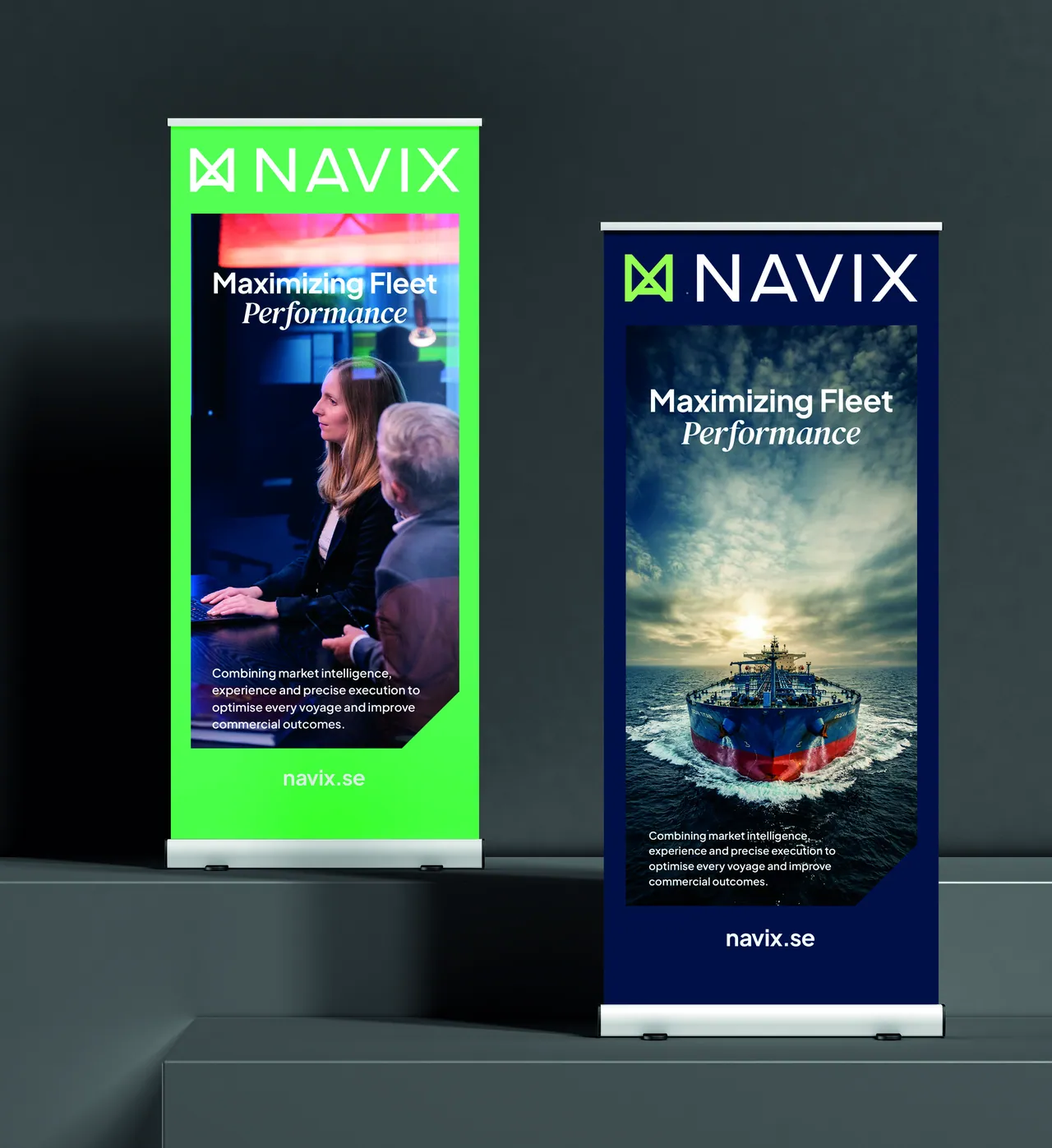
Two Navix roll-up banners, one Digital Green and one Deep Sea Blue, both headed Maximizing Fleet Performance.

01 Plus Jakarta Sans & DM Serif

Typefaces

Navix uses Plus Jakarta Sans (01.) as the primary typeface in all communication. It is the typeface that carries the identity and is used for headlines, body copy and all other information.

DM Serif (02.) is used as an accent typeface to create contrast and character. It is used sparingly – mainly in overlines or to lift single words and messages, for example Performance in the main message Maximizing Fleet Performance.

DM Serif should therefore work as a complement, not as an equal main typeface.

The main message

Maximizing Fleet Performance

Plus Jakarta Sans carries the line – DM Serif Text Italic lifts a single word.

Plus Jakarta Sans

Regular, SemiBold & Bold

Primary typeface

Headlines, body copy and all other information. Plus Jakarta Sans carries the identity in every channel.

Lowercase
abcdefghijklmnopqrstuvwxyzåäö
Uppercase
ABCDEFGHIJKLMNOPQRSTUVWXYZÅÄÖ
Numerals
1234567890

Point at a character, or use the arrow keys, to see it up close.

Approved weights

  • Regular 400

    Headlines and body copy

  • SemiBold 600

    Body copy on complex backgrounds

  • Bold 700

    Headlines

DM Serif Text

Italic

Accent typeface

Overlines, short introductions and selected words. Used sparingly – a complement, never an equal.

Lowercase
abcdefghijklmnopqrstuvwxyzåäö
Uppercase
ABCDEFGHIJKLMNOPQRSTUVWXYZÅÄÖ
Numerals
1234567890

Point at a character, or use the arrow keys, to see it up close.

Where it is used

  • Overlines

    Our vision

  • Short introductions

    Our mission is to help shipowners get more out of every vessel.

  • Selected words

    Maximizing Fleet Performance

Try it

Type tester

Write your own line and try the brand typefaces. The approved weights are marked on the scale – everything in between is for exploring only.

Typeface
Surface
96 px
Bold 700

Approved weight

Maximizing Fleet Performance
Scale step: H2 font: 700 96px/1.06 'Plus Jakarta Sans'; letter-spacing: -0.03em

Sans headline with one accent word in DM Serif Text Italic.

Fonts

Download the fonts

Plus Jakarta Sans and DM Serif Text are both free Google Fonts, released under the SIL Open Font License (OFL). They can be installed and used freely in print, presentations and on the web.

navix-fonts.zip

ZIP · 875 KB

Includes Plus Jakarta Sans and DM Serif Text

Download fonts

02 Three levels, five styles

Typographic hierarchy

Navix typography is built on clear levels, where size, weight and placement create structure and help readers find their way through the content quickly.

Hierarchy is created first and foremost through size, weight and placement – with a few clear levels rather than many different styles.

The levels

Point at, tap or scroll through the levels to see where each one sits in a layout.

Commercial management

Maximizing Fleet Performance

Chartering, operations, claims and accounting.

Combining market intelligence, experience and precise execution to optimise every voyage and improve commercial outcomes.

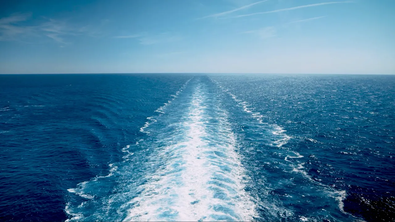
The white wake behind a ship on a deep blue sea.

In a volatile market, experience and timing matter.

Example layout combining every level.

Plus Jakarta Sans Bold (1.1) / Regular (1.2)

Plus Jakarta Sans is used for headlines, subheadings and body text. Headlines can be set in Bold (1.1) or Regular (1.2), depending on expression and context.

  • Headlines can be set in Bold (1.1)

    Typeface
    Plus Jakarta Sans
    Weight
    Bold 700
    Size
    36–80 px
    Line height
    1.06
    Tracking
    −0.03 em
  • Headlines can be set in Regular (1.2)

    Typeface
    Plus Jakarta Sans
    Weight
    Regular 400
    Size
    36–80 px
    Line height
    1.06
    Tracking
    −0.03 em

DM Serif Italic (2.1)

DM Serif Italic (2.1) is used sparingly as an accent – for example in overlines, shorter introductions or selected words.

  • Overline / accent (2.1)

    Typeface
    DM Serif Text Italic
    Weight
    Regular 400
    Size
    18–24 px · or headline size as accent
    Line height
    1.2
    Tracking
    −0.01 em

Plus Jakarta Sans Regular (3.1) or SemiBold (3.2)

Body text (3.1) is primarily set in Regular, while SemiBold (3.2) can be used when the text needs more clarity – for example against a more complex background.

  • Body text (3.1) is used for running text in, for example, printed matter, articles and on the web.

    Typeface
    Plus Jakarta Sans
    Weight
    Regular 400
    Size
    16–20 px
    Line height
    1.6
    Tracking
    0
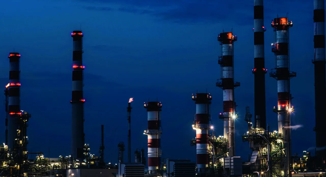
  • Refinery towers lit up against a deep blue night sky.

    Body text (3.2) can also look like this on a complex background.

    Typeface
    Plus Jakarta Sans
    Weight
    SemiBold 600
    Size
    16–20 px
    Line height
    1.6
    Tracking
    0

Web sizes are fluid between small and large screens.

In practice

A few rules of thumb that keep the typography consistent across every channel.

  • Maximizing Fleet Performance

    Do

    Let one word carry the accent

    Lift a single word or short phrase with DM Serif Italic. The rest of the headline stays in Plus Jakarta Sans.

  • Maximizing Fleet Performance

    Don’t

    Don’t make the serif the main voice

    Avoid setting whole headlines or running text in DM Serif. It is a complement, not an equal.

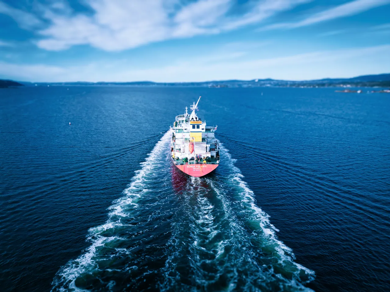
  • Aerial view of a tanker at sea from behind, with its wake.

    In a volatile market, experience and timing matter.

    Do

    SemiBold on complex backgrounds

    Switch body text to SemiBold when it is placed on photography or other busy surfaces.

  • Maximizing Fleet Performance

    Don’t

    Don’t add styles to create hierarchy

    Extra weights, capitals, underlines and colours compete with each other. Use size, weight and placement instead.

Visual identity

Colours

Eight colours in three tiers – a clear and consistent palette for everything Navix communicates.

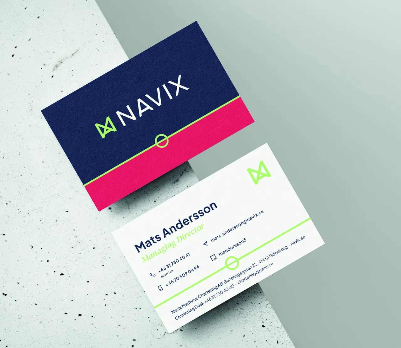
Navix business cards: a Deep Sea Blue front with a Brand Red band and a Brand Green Loadline, and a white reverse with Deep Sea Blue type.

01 Eight colours, three tiers

Our colours

The Navix colour palette is built on three tiers – primary, complementary and accent colours – each with its own role.

Deep Sea Blue is the base. Pure White and Digital Green add contrast, clarity and accents.

  1. 01.

    Primary colours

    The primary colours form the foundation of the identity, with Deep Sea Blue as the main base. Pure White and Digital Green complete the expression and are used for contrast, clarity and accents.

  2. 02.

    Complementary colours

    The complementary colours are Sand Beige, Signal Blue and Carbon Black. They create variation and flexibility without competing with the main palette.

  3. 03.

    Accent colours

    The accent colours are used more selectively. Brand Red is used to draw particular attention. Brand Green is primarily tied to the Navix logotype, while Digital Green is the first choice for green accents in all other communication.

Select any value to copy it.

01.

Primary colours

The primary colours form the foundation of the identity, with Deep Sea Blue as the main base. Pure White and Digital Green complete the expression and are used for contrast, clarity and accents.

Deep Sea Blue

Base

The main colour of the identity and the base for most surfaces.

CMYK
RGB
HEX
PMS

Pure White

Contrast

Creates contrast and clarity – for type on Deep Sea Blue and for open, light surfaces.

CMYK
RGB
HEX
PMS
No PMS value

Digital Green

Focus

Used selectively for focus and green accents – never for large fields of text.

CMYK
RGB
HEX
PMS

02.

Complementary colours

The complementary colours are Sand Beige, Signal Blue and Carbon Black. They create variation and flexibility without competing with the main palette.

Sand Beige

Soft surfaces

A warm, neutral background – also in reduced opacity for softer background levels.

CMYK
RGB
HEX
PMS

Signal Blue

Variation

Complements Deep Sea Blue to create variation between surfaces and sections.

CMYK
RGB
HEX
PMS

Carbon Black

Typography

The colour of type on light surfaces – and, in reduced opacity, of neutral backgrounds.

CMYK
RGB
HEX
PMS

03.

Accent colours

The accent colours are used more selectively. Brand Red is used to draw particular attention. Brand Green is primarily tied to the Navix logotype, while Digital Green is the first choice for green accents in all other communication.

Brand Red

Attention

For what needs particular attention. Use sparingly, preferably with Deep Sea Blue.

CMYK
RGB
HEX
PMS

Brand Green

Logotype

Primarily tied to the logotype. For green accents elsewhere, use Digital Green.

CMYK
RGB
HEX
PMS

In balance

Deep Sea Blue carries the identity. Pure White gives contrast and air, the complementary colours add variation, and the accents appear in small doses.

Illustrative – not a fixed ratio

  • Deep Sea Blue Base
  • Pure White Contrast
  • Sand Beige Soft surfaces
  • Signal Blue Variation
  • Carbon Black Typography
  • Digital Green Focus
  • Brand Red Attention
  • Brand Green Logotype

02 Five principles

Colour usage

How the colours work together – from the base that carries every layout to the accents that are used with care.

  1. 01. Base and contrast

    Deep Sea Blue is the main colour. Pure White creates contrast, and Digital Green is used selectively for focus.

    In practiceLet Digital Green mark what matters most – a figure, a button, a highlight.

  2. 02. Light communication

    On light surfaces, Carbon Black is used for typography and Digital Green for smaller accents.

    In practiceOn white, green works best as a shape – a rule, a dot, an icon or a button. Keep text in Carbon Black.

  3. 03. Neutral tones

    Sand Beige and Carbon Black can be used in reduced opacity to create softer background levels.

    In practiceUse tints for backgrounds, cards and dividers. Keep type in full-strength Carbon Black.

  4. 04. Accent

    Brand Red is used sparingly when something needs particular attention, preferably together with Deep Sea Blue.

    In practiceGive red one clear job – a band, a label, a single highlight – and let Deep Sea Blue carry the rest.

  5. 05. Complementary blue

    Signal Blue complements Deep Sea Blue to create variation between surfaces and sections.

    In practiceAlternate the two blues to separate sections in presentations, documents and web pages.

01. Base and contrast

Deep Sea Blue is the main colour. Pure White creates contrast, and Digital Green is used selectively for focus.

In practiceLet Digital Green mark what matters most – a figure, a button, a highlight.

02. Light communication

On light surfaces, Carbon Black is used for typography and Digital Green for smaller accents.

In practiceOn white, green works best as a shape – a rule, a dot, an icon or a button. Keep text in Carbon Black.

Sand Beige 100%
60%
30%
15%
Carbon Black 100%
60%
30%
15%

Opacity on white

03. Neutral tones

Sand Beige and Carbon Black can be used in reduced opacity to create softer background levels.

In practiceUse tints for backgrounds, cards and dividers. Keep type in full-strength Carbon Black.

04. Accent

Brand Red is used sparingly when something needs particular attention, preferably together with Deep Sea Blue.

In practiceGive red one clear job – a band, a label, a single highlight – and let Deep Sea Blue carry the rest.

05. Complementary blue

Signal Blue complements Deep Sea Blue to create variation between surfaces and sections.

In practiceAlternate the two blues to separate sections in presentations, documents and web pages.

Approved combinations

Every text colour against every background colour, with its WCAG contrast ratio. Body text needs at least 4.5:1; large text, icons and graphic elements at least 3:1.

  • AAA7:1 or more – all text
  • AA4.5:1 or more – body text
  • Large3:1 or more – large text and graphics only
  • LowBelow 3:1 – avoid for text
  • Pairing described in this guide
  • Not for body text

Select a pairing to preview it. Use the arrow keys to move through the grid.

Contrast ratio of each text colour on each background colour
Background Text Deep Sea Blue Pure White Sand Beige Signal Blue Carbon Black Brand Red Digital Green
Pure White Same colour
Carbon Black Same colour
Deep Sea Blue Same colour
Digital Green Same colour
Sand Beige Same colour

Digital Green on white reaches only 2.0:1. On light surfaces, set text in Carbon Black and use Digital Green as a shape – a rule, a dot, an icon or a button.

In code

The palette as CSS custom properties, ready to paste into a stylesheet. Use the HEX values for screens, CMYK and PMS for print.

:root {
  --navix-deep-sea:      #041E42;  /* Deep Sea Blue */
  --navix-white:         #FFFFFF;  /* Pure White */
  --navix-digital-green: #26D07C;  /* Digital Green */
  --navix-sand:          #F6E7CE;  /* Sand Beige */
  --navix-signal-blue:   #0047BB;  /* Signal Blue */
  --navix-carbon:        #121212;  /* Carbon Black */
  --navix-brand-red:     #CD1239;  /* Brand Red */
  --navix-brand-green:   #AACD72;  /* Brand Green */
}

Visual identity

Graphic elements

A few recurring shapes – the cut corner, the Loadline and a quiet set of outline icons – make Navix recognisable without ever dominating the expression.

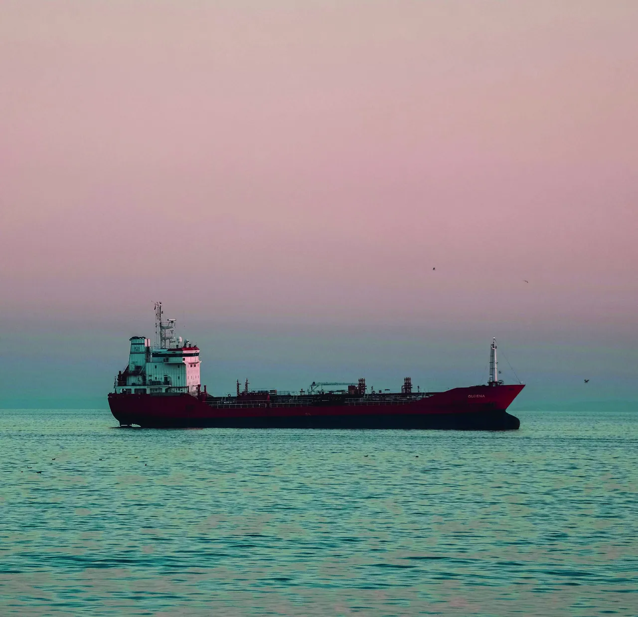
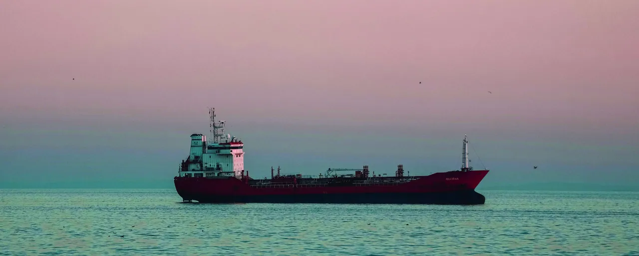
Red product tanker at sea under a pink dusk sky

01 Shape language

The cut corner

Navix’s visual expression is pared back and built on a small number of recurring shape elements. The clearest signature detail is the cut corner, used on image frames and buttons, for example. The shape is inspired by the bow of a tanker and creates a subtle link to Navix’s business. It is used consistently and with restraint – building recognition without dominating the expression.

From the printed guide

Red product tanker at sea at dusk, framed with a cut corner inside a Deep Sea Blue banner with the Navix logotype
01. Banner
Senior man smiling in a meeting, seen through glass – an image frame with the cut corner
02. Image frames
Open-plan office seen through glass, with ship models in the foreground

03. ButtonsLive components – primary and secondary both carry a 12 px cut.

Explore the cut

One corner, always 45°

The chamfer sits on the bottom-right corner and is always cut at 45°. Its size follows the element – generous on large image frames, small on buttons. Try it on different elements and see where it starts to dominate.

Element
60 px · 45°

Within the recommended range

Recommended 28–80 px

Switching element resets the corner to its recommended size.

Web specification

Four sizes, defined as CSS custom properties. Click a token to copy it.

  • Hero images and banners 28–80 pxScales with the viewport
  • Cards and content images 18–40 pxScales with the viewport
  • Buttons 12 pxFixed
  • Tags and small labels 8 pxFixed
clip-path: polygon(0 0, 100% 0, 100% calc(100% - var(--cut)), calc(100% - var(--cut)) 100%, 0 100%);

Use it with restraint

  • Do

    Bottom-right, 45°

    One corner, always the bottom right, always cut at 45° – like the bow of a tanker.

  • Do

    Where it adds recognition

    Image frames, buttons and key cards. Most other surfaces stay square.

  • Avoid

    Every corner

    Cutting several corners turns the signature into decoration.

  • Avoid

    Other angles or rounding

    No shallow cuts, steep cuts or rounded corners – consistency builds recognition.

02 Symbols

The Loadline

The Loadline symbol is inspired by the marking used on ships and works as a recurring graphic carrier of the identity. It can be used on its own, but can also be integrated into the layout as a graphic divider between colour fields and content areas.

01. Standalone

Inspired by the load line

On a ship’s hull, the load line – a ring crossed by a horizontal bar – marks how deep the vessel may safely be loaded. The Navix symbol borrows that form: a ring and a bar, simple enough to work at any size.

On Deep Sea Blue the symbol can be set in a muted blue tint for a quiet, tone-on-tone effect – as here.

Download the symbols

Vector files for digital use, and the complete symbol pack with EPS, PNG and SVG versions of the Loadline and the logomark.

  • Loadline – Brand Green

    SVG · 505 B

    Download
  • Loadline – White

    SVG · 505 B

    Download
  • Symbol pack

    ZIP · 4.1 MBLoadline and logomark · EPS, PNG, SVG

    Download

02. As a divider

A line between fields

As a divider, the bar becomes a white line between two colour fields, with the ring resting on it – always at the exact centre of the line. Drag the ring up or down to move the boundary and balance the two fields.

Lower field
  1. 01Run the line edge to edge – it divides the whole surface.
  2. 02The ring always sits at the exact centre of the line – never offset it.
  3. 03Brand Red is an accent – pair it with Deep Sea Blue, as here.

03 Iconography

Simple outline icons

Navix iconography is built on a simple outline expression with even line work and limited detail. Most icons are based on Google Icons, which makes the system easy to use and develop further in-house.

02. The icon set

Material Symbols Outlined, unfilled. Hover an icon to see its name – click to copy it.

Weight
Size

From the guide

03. On colour

Icons can be combined with the identity’s colours and background surfaces, following the guidelines for colour usage.

  • Deep Sea Blue

    Digital Green

    directions_boat

  • Digital Green

    Deep Sea Blue

    language

  • Signal Blue

    Pure White

    weight

  • Sand Beige

    Deep Sea Blue

    history_edu

Custom icons

When the set runs short

When new or custom icons are created, they should follow the same visual principles to keep the expression consistent.

  1. 01

    Same stroke

    Match the line weight of the Outlined set – never thinner, never bolder.

  2. 02

    Same grid

    Draw on a 24 × 24 px grid with a 2 px safe area, like Material Symbols.

  3. 03

    Limited detail

    Simple, geometric shapes. If it doesn’t read at 20 px, simplify.

  4. 04

    Outline only

    No fills, gradients or second colours inside the icon.

Browse Material Symbols on Google Fonts
ıce
Custom icon from the guide, drawn to the same principles.

Visual identity

Imagery

Close relationships on the global stage – how Navix photography balances people and presence with ships, sea and markets.

Smiling woman in a dark blue office, a colleague blurred in the foreground

01 Image concept

Close relationships on the global stage

Navix imagery is built on the contrast between the close and the global. The people, the collaboration and the decisions show the personal and professional presence, while ships, sea and market environments place the business in a wider international context.

Navix is always at the intersection of the two. It is where close relationships meet a global, ever-changing market – and where the commercial work takes shape.

Close
People, collaboration, decisions
Global
Ships, sea, markets

Putting it to work

  1. 01Pair a close image with a global one when space allows – the contrast carries the idea.
  2. 02Let the Loadline mark the meeting point between the two, as here.
  3. 03Close means people in real work situations. Global means scale, sea and movement.
Woman in profile, focused on a screen in a softly lit office
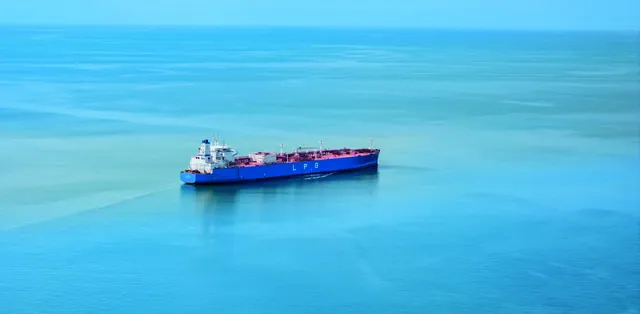
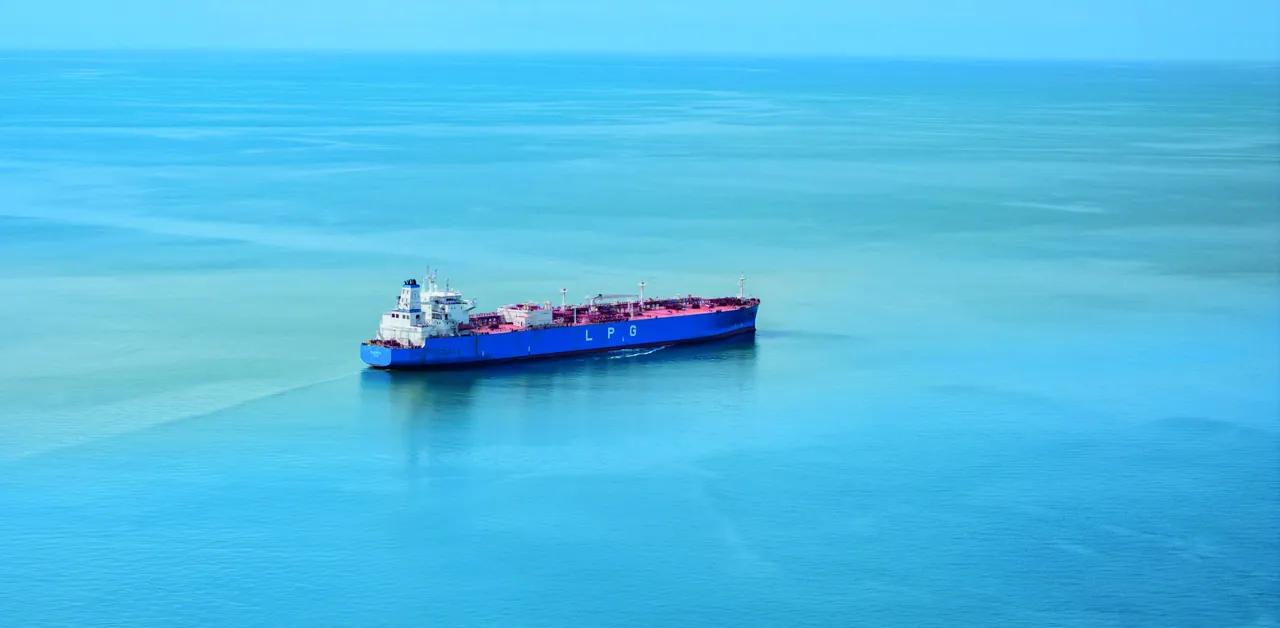
Aerial view of a tanker under way on a calm turquoise sea

02 Imagery in practice

Imagery in practice

Two families of images carry the Navix expression. Used together – the close and the global – they give the whole picture.

01.

People & environment

Focus on people, collaboration and the environments where the business takes shape. The expression should feel natural, welcoming and professional – with a clear presence and credibility rather than an overly arranged impression.

Aim for

  • Natural moments of real work and conversation
  • Welcoming expressions with a professional presence
  • The places where the work happens – desks, screens, meeting rooms

Avoid

  • Overly arranged or posed scenes
  • Generic stock imagery that lacks credibility

02.

Marine & market

Images that show the maritime context around Navix – ships, sea, ports and other environments connected to the international tanker market. The expression may be more atmospheric, conveying scale, movement and the market Navix operates in.

Aim for

  • Atmosphere – dusk, open sea, natural light
  • Scale and movement – wakes, horizons, aerial views
  • Settings tied to the tanker market – ports, terminals, refineries

Avoid

  • Heavily filtered or dramatised images
  • Ships and settings unrelated to the tanker market

Portraits

One series, many faces

Staff portraits share one setup: standing, three-quarter length, photographed in the office with the background softly out of focus. New portraits should match the series in light, framing and depth.

Before you publish

  1. 01

    Real people and real situations – credibility before polish.

  2. 02

    Keep faces and key details clear of the bottom-right corner, where a frame may be cut.

  3. 03

    Natural colour and light – no heavy filters.

  4. 04

    Balance the close and the global across a page, deck or feed.

Photo packs

JPG files ready for presentations, web and social channels.

  • Portraits

    17 images · JPG · 42.8 MB

    Download
  • People & environment

    26 images · JPG · 56.2 MB

    Download
  • Marine & market

    3 images · JPG · 14.5 MB

    Download